Event pages now convert 50% better
In this post, we take a look at the improvements delivered with the new Event Page template and how they've resulted in a 50.3% improvement on conversion rate.
There was a clear aim to this project: to improve the conversion rate of event page views to event bookings.
The design
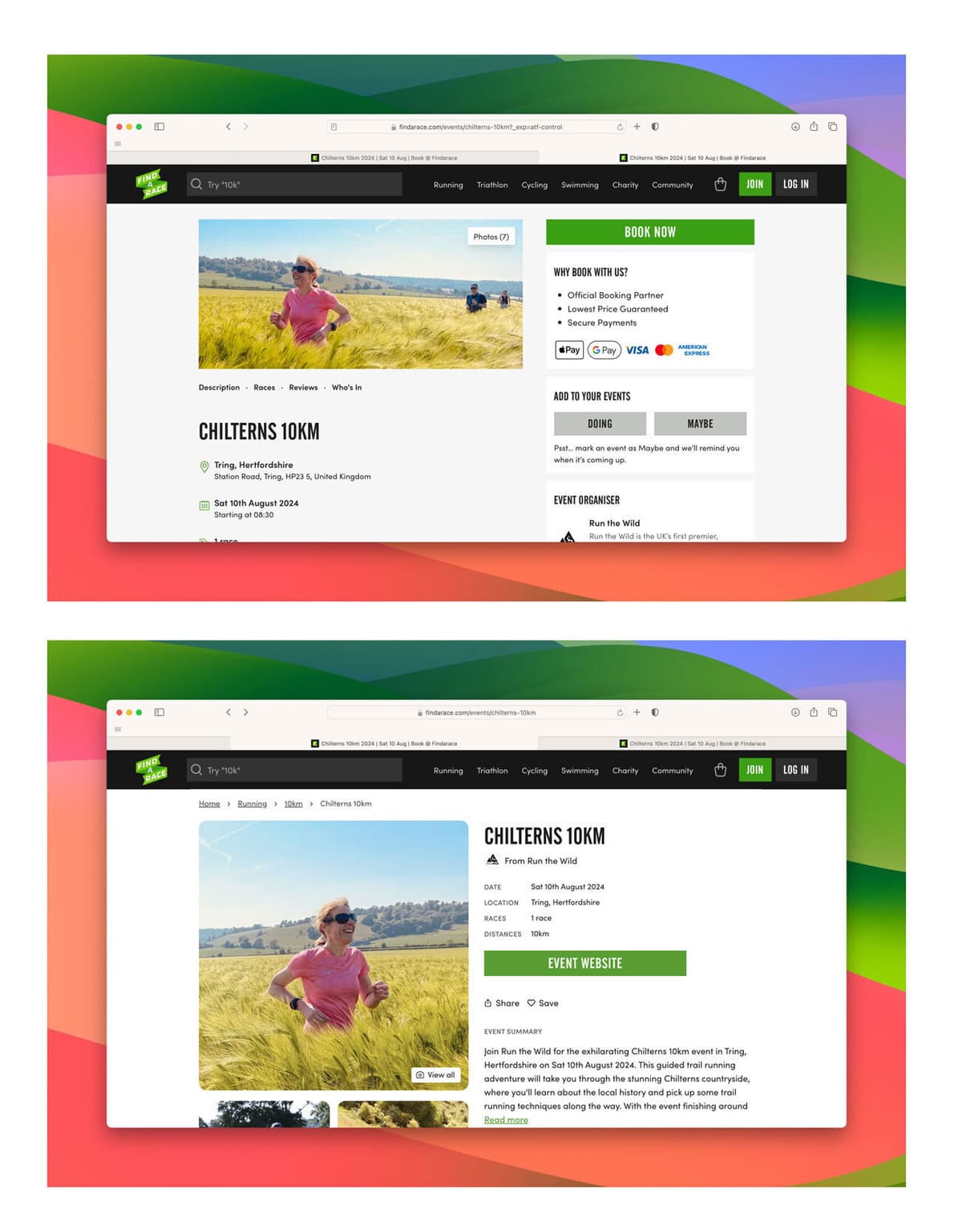
The new design brings a traditional e-commerce layout to this part of the event page. This is most noticeable on desktop, where by the product image is on the left and the key info and CTA are on the right. Consideration has been given to ensure that as much of the key information is immediately visible on page load.
The design brings a larger main gallery image, as well as exposing up to three images where available.
On mobile the changes are less drastic, due to the stacked nature of the content, however some things have been reorganised. The gallery is pushed down to bring the content up to being the first thing you see. We've also been able to introduce more information into the booking bar (date & price) and increased the size of the book button.
The Event page desktop view, before and after:

New features
There are some notable new features as part of the update, all geared towards improving conversion rate.
Persuasion banner
We've introduced a persuasion banner. This is a call out section that highlights the potential selling points of an event. We have a set of defaults that include whether an event is popular (high rated reviews), has had multiple bookings (based on actual sales), if the race is selling out, closing soon or has been recently listed. Whichever messages are relevant to the event will be rotated within the banner.

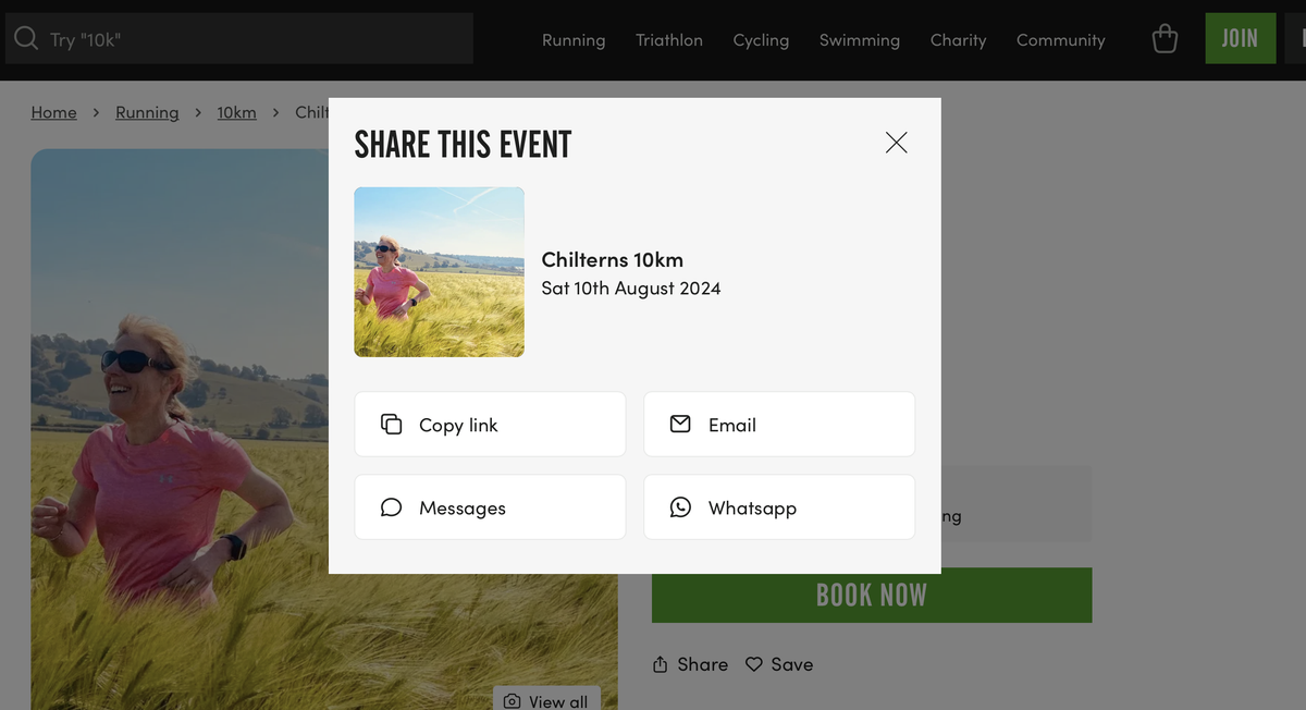
Share
We've included a simple share button which offers easy access to sharing an event with others. The modal opens with links to key messaging services: Messages, Email, WhatsApp or just copying the link.

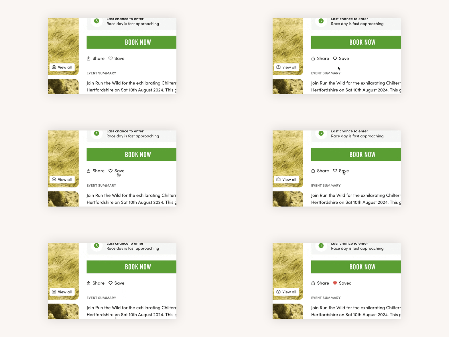
Save
We've introduced a simple way for users to 'save' an event. This is a common, widely recognised way of simply bookmarking an event for later reference. Hit the save button and it updates to show the event is saved. Any saved event can be found under the 'Saved' section of a user's account.

Gallery
There have been multiple improvements made to the gallery section. We now adapt the layout based on either one, two or three images being available. Three is the optimum. The images have all been reduced in size, whilst not compromising in quality, so they should load quickly and efficiently. The gallery opens up when an image is clicked to a full size scrollable list of images, not dissimilar to what we had before, but it is now full width on mobile devices.
Additionally in the gallery, we are now using an AI service to provide full description text on the images to assist with accessibility for visually impaired users.
Taking the above event as an example, this is now the alt text of the main image "A woman in a pink shirt is running through a field of tall grass on a sunny day. She is smiling and wearing sunglasses and a smartwatch. Three other runners are in the background, with green hills and a clear blue sky visible."
Results
Update: 16 September 2024.
Event pages now convert 50.33% better
AB testing across a sample of events has shown a significant impact. The rate at which an event page view converts into a booking has increased by 50.33%. The rate at which an event page view converts into a click on the 'Book Now' button saw an even higher increase of 65.31%.
Next steps
This is the first part of a larger project covering our Event pages. We'll keep you updated on progress with that and other projects. Amongst other upcoming releases on the roadmap are:
- Improved analytics available in the Organiser Dashboard
- Automated reporting straight into your inbox
As always, get in touch if you have any queries on this release, or input on future improvements: support@findarace.com
More from the blog

findarace.com x RaceNation integration
24 Sept 2025
Our new integration with leading registration provider, RaceNation.
Read on
Case study: Nice Work
24 Jul 2025
Findarace help Nice Work grow their events with thousands of bookings from new runners.
Read on

